

3 key insights that help you learn D3.js from scratch
Somebody once asked me how to learn D3.js from scratch. I quipped that it took me writing a book to really learn it. It's one hell of a library.
Most people don't go that far. They don't have to.
You start with a problem, find similar examples, do some copy pasta, tweak until it works and end up with a working visualization you don't understand. You'd be surprised how few engineers actually understand how their D3 data visualization works.
Fear not! There are just 3 key concepts you have to grok. Then you can understand every D3 example out there. 😱
1) Data manipulation vs. DOM manipulation
All D3 examples are split into two parts:
- Data manipulation
- DOM manipulation
First you prep your values, then you render.
You have to go through many examples to notice what's going on. Inference learning is hard. Most beginners miss this pattern and it makes D3 look more confusing than it is.
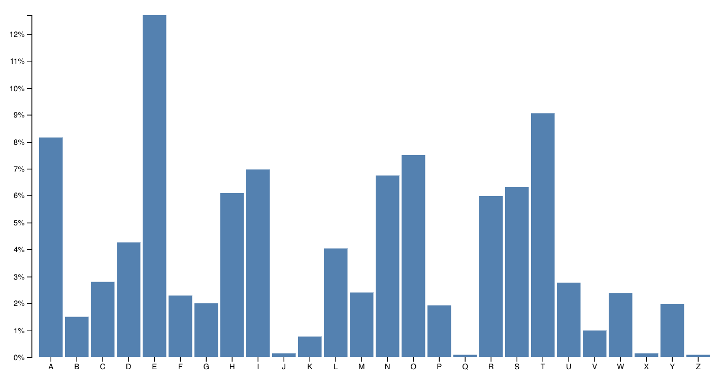
Let's take an example from D3's docs, a bar chart with a hover effect.
You can try it online.
When you hover on a bar, it changes color. Pretty neat.
Mike Bostock, the creator of D3, built this chart in 43 lines of code. Here they are 👇
var svg = d3.select("svg"),margin = { top: 20, right: 20, bottom: 30, left: 40 },width = +svg.attr("width") - margin.left - margin.right,height = +svg.attr("height") - margin.top - margin.bottomvar x = d3.scaleBand().rangeRound([0, width]).padding(0.1),y = d3.scaleLinear().rangeRound([height, 0])var g = svg.append("g").attr("transform", "translate(" + margin.left + "," + margin.top + ")")d3.tsv("data.tsv",function (d) {d.frequency = +d.frequencyreturn d},function (error, data) {if (error) throw errorx.domain(data.map(function (d) {return d.letter}))y.domain([0,d3.max(data, function (d) {return d.frequency}),])g.append("g").attr("class", "axis axis--x").attr("transform", "translate(0," + height + ")").call(d3.axisBottom(x))g.append("g").attr("class", "axis axis--y").call(d3.axisLeft(y).ticks(10, "%")).append("text").attr("transform", "rotate(-90)").attr("y", 6).attr("dy", "0.71em").attr("text-anchor", "end").text("Frequency")g.selectAll(".bar").data(data).enter().append("rect").attr("class", "bar").attr("x", function (d) {return x(d.letter)}).attr("y", function (d) {return y(d.frequency)}).attr("width", x.bandwidth()).attr("height", function (d) {return height - y(d.frequency)})})
There are two parts to this code: Data manipulation and DOM manipulation.
var // ..,margin = { top: 20, right: 20, bottom: 30, left: 40 },width = +svg.attr("width") - margin.left - margin.right,height = +svg.attr("height") - margin.top - margin.bottomvar x = d3.scaleBand().rangeRound([0, width]).padding(0.1),y = d3.scaleLinear().rangeRound([height, 0])// ...d3.tsv("data.tsv",function (d) {d.frequency = +d.frequencyreturn d},function (error, data) {if (error) throw errorx.domain(data.map(function (d) {return d.letter}))y.domain([0,d3.max(data, function (d) {return d.frequency}),])// ...})
Bostock here first prepares his data:
- some sizing variables (
margin,width,height) - two scales to help with data-to-coordinates conversion (
x, y) - loads his dataset (
d3.tsv) and updates his scales' domains
In the DOM manipulation part, he puts shapes and objects into an SVG. This is the part that shows up in your browser.
var svg = d3.select("svg"),// ..// ..var g = svg.append("g").attr("transform", "translate(" + margin.left + "," + margin.top + ")");// ..g.append("g").attr("class", "axis axis--x").attr("transform", "translate(0," + height + ")").call(d3.axisBottom(x));g.append("g").attr("class", "axis axis--y").call(d3.axisLeft(y).ticks(10, "%")).append("text").attr("transform", "rotate(-90)").attr("y", 6).attr("dy", "0.71em").attr("text-anchor", "end").text("Frequency");g.selectAll(".bar").data(data).enter().append("rect").attr("class", "bar").attr("x", function(d) { return x(d.letter); }).attr("y", function(d) { return y(d.frequency); }).attr("width", x.bandwidth()).attr("height", function(d) { return height - y(d.frequency); });});
DOM manipulation in D3 happens via D3 selections. They're a lot like jQuery
$(something). This is the part we're doing with React later on.
Here Bostock does a few things
- selects the
<svg>node (d3.select) - appends a grouping
<g>node (.append) with an SVG positioning attribute (translate) - adds a bottom axis by appending a
<g>, moving it, then callingd3.axisBottomon it. D3 has built-in axis generators - adds a left axis using the same approach but rotating the ticks
- appends a text label "Frequency" to the left axis
- uses
selectAll.datato make a virtual selection of.barnodes and attach some data, then for every new data value (.enter), appends a<rect>node and gives it attributes
That last part is where people get lost. It looks like magic. Even to me.
It's a declarative approach to rendering data. Works great, hard to understand. That's why we'll do it in React instead 😃
You can think of .enter as a loop over your data. Everything chained after
.enter is your loop's body. Sort of like doing
data.map(d => append(rect).setManyAttributes())
That function executes for any new data "entering" your visualization.
There's also .exit for anything that's dropping out, and .update for
anything that's changing.
2) Scales
Scales are D3's most versatile concept. They help you translate between two different spaces. Like, mathematical spaces.
They're like the mathematical functions you learned about in school. A domain maps to a range using some sort of formula.

Colored shapes in the domain map to colors in the range. No formula for this one. That makes it an ordinal scale.
let shapes = d3.scaleOrdinal().domain(['red', 'orange', ...).range(['red', 'orange', ...)
Play with scales on CodeSandbox
Once you have this scale, you can use it to translate from shapes to colors.
shapes('red triangle') returns 'red' for example.
Many different types of scales exist. Linear, logarithmic, quantize, etc. Any basic transformation you can think of exists. The rest you can create by writing custom scales.
You're most often going to use scales to turn your data values into coordinates. But other use-cases exist.
3) D3 layouts
Sure .enter.append looks like magic, but D3 layouts are the real mind=blown
of the D3 ecosystem. They take your input data and return a full-featured
visualization thing.
For example, a force layout using forces between nodes to place them on the screen.
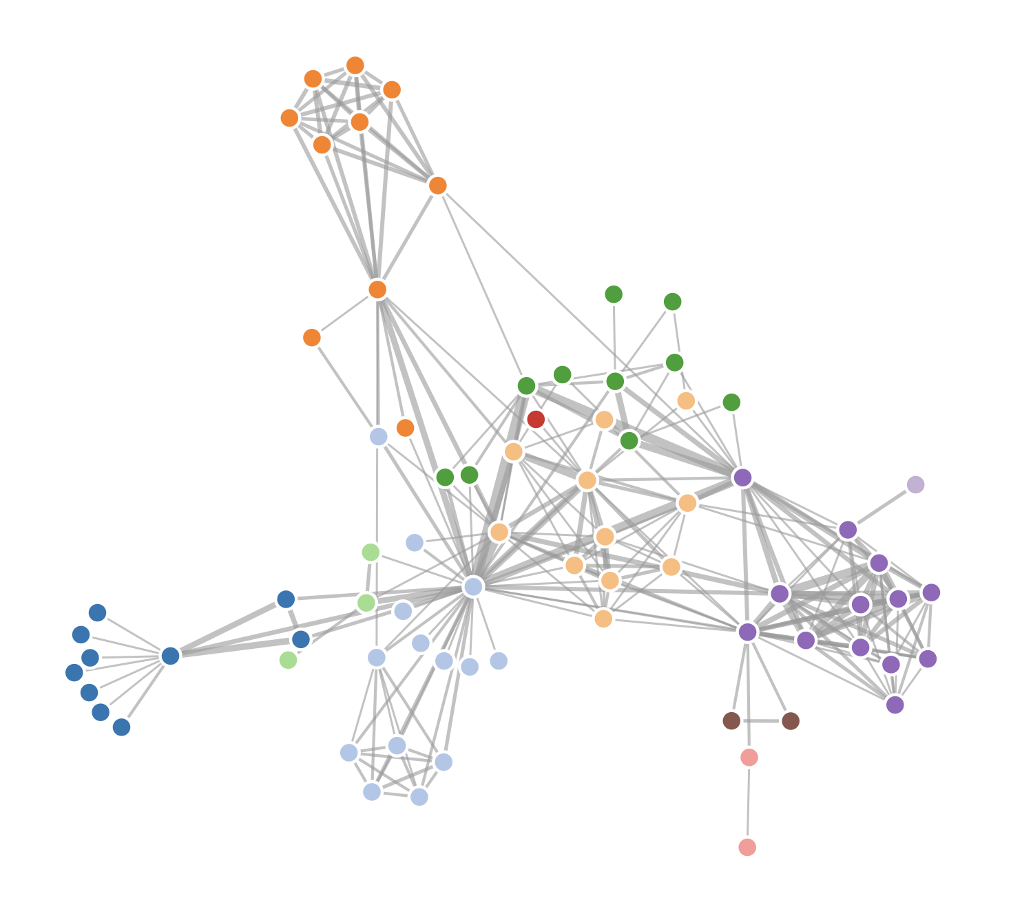
Or a circle packing layout that neatly packs circles.
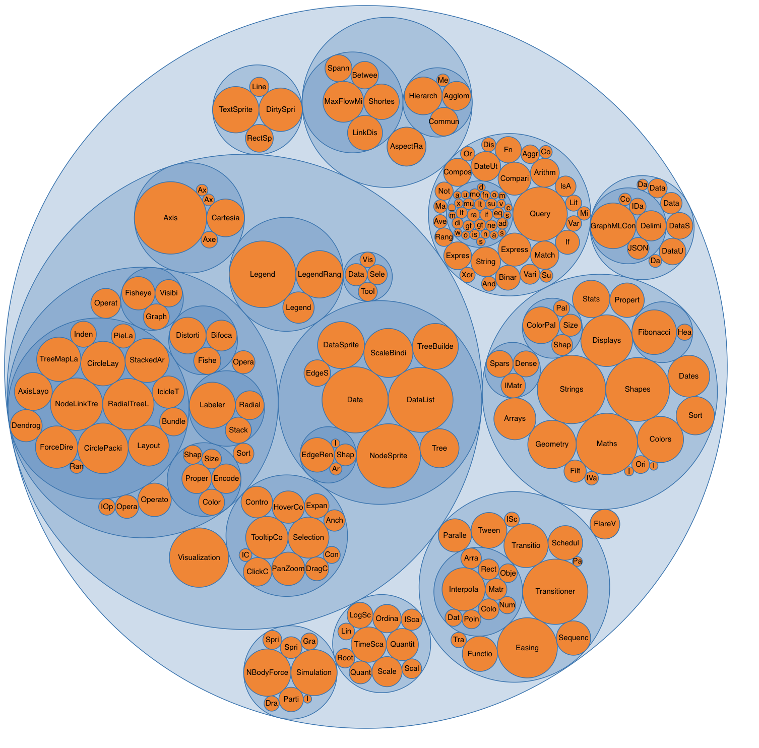
I don't know the maths that goes into most of these. And that's the point, you shouldn't have to!
Here's a key insight about the magic of layouts: They're the data part.
You take a forceLayout and feed it your data. It returns an object with a
tick event callback.
var simulation = d3.forceSimulation().force("link",d3.forceLink().id(function (d) {return d.id})).force("charge", d3.forceManyBody()).force("center", d3.forceCenter(width / 2, height / 2))
This simulation now handles everything about rendering your nodes. Changes
their positions on every tick callback, figures out how often to change
stuff, etc.
But it is up to you to render them. A layout handles your dataviz in the abstract. You're in control of the rendering.
For a force layout, you have to update the DOM on every tick of the animation. For circle packing, you render it once.
Once you grok this, all the fancy visualizations out there start making sense. Also means you can use these fancy layouts in React 🙌