

Why React and D3
React is Facebook's approach to writing modern JavaScript front-ends. It encourages building an app out of small, re-usable components. Each component is self-contained and only knows how to render a small bit of the interface.
The catch is that many frameworks have attempted this: everything from Angular to Backbone and jQuery plugins. But where jQuery plugins get become messy, Angular depends too much on HTML structure, and Backbone needs a lot of boilerplate, React has found a sweet spot.
I've found React a joy to use. Using React was the first time in my life that I could move a piece of HTML in a modern app without rewriting half my JavaScript. It's like a super power.
React being the most popular JavaScript framework out there, the world seems to agree. React is great. :atom_symbol:
D3 is Mike Bostock’s infamous data visualization library. It's used by The New York Times along with many other sites. It is the workhorse of data visualization on the web, and many charting libraries out there are based on it.
But D3 is a fairly low-level library. You can’t just say "I have data; give me a bar chart". Well, you can, but it takes a few more lines of code than that. Once you get used to it though, D3 is a joy to use.
Just like React, D3 is declarative.
You tell your code what you want instead of how you want it. It gives you access straight to the SVG so you can manipulate your lines and rectangles as you want. The problem is that D3 isn't so great, if all you want are charts.
That's where React comes in.
Once you’ve created a histogram component, you can always get a histogram with
<Histogram x="5" ... />. Once you have a piechart, it's always
<Piechart x="20" ... />. Just like they were HTML elements.
Doesn’t that sound like the best? I think it's amazing.
It gets better!
With React, you can make different graph and chart components share the same data. When your data changes, the whole visualization reacts.
Your graph changes. The title changes. The description changes. Everything changes. Mind, blown.
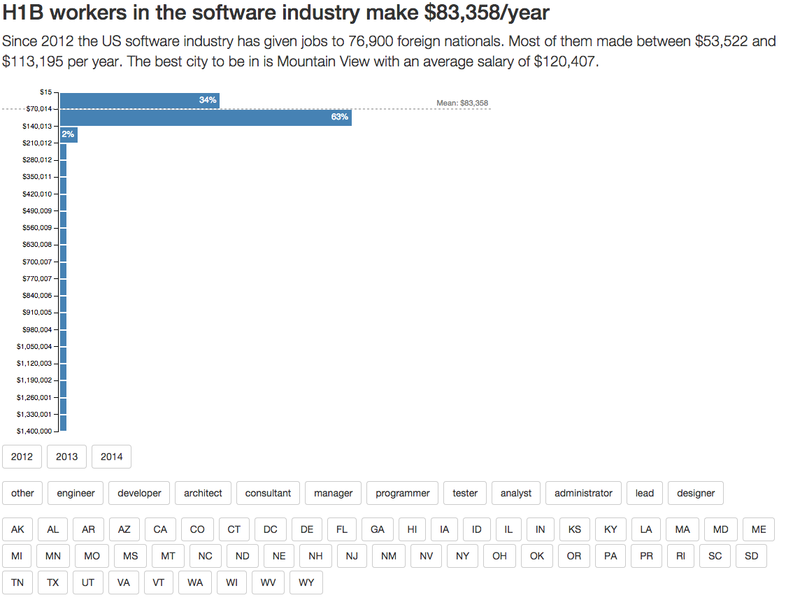
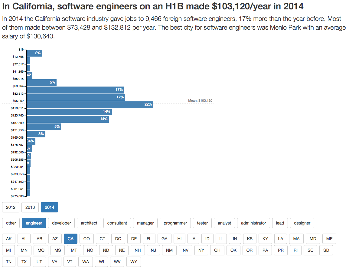
Look how this H1B salary visualization changes when the user picks a subset of the data to look at.
React + D3: a powerful combination indeed.