

Make it understandable - meta info
You've come so far! There's a US map and a histogram. They're blue and shiny and you look at them and you go "Huh?".
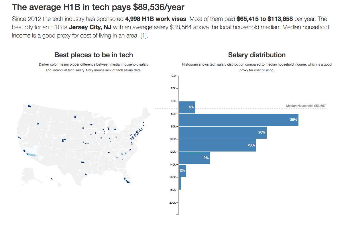
The key to a good data visualization is telling users what it means. An easy way to do that is a good title and description. Just tell them. The picture supports the words, the words explain the picture.
Let's add those words.
We're adding a dynamic title and description, and a median line on the histogram. The text is dynamic because we're adding user controls later, and we want the pictures and the words to stay in sync.
At the end of this section, you'll have a full visualization of the shortened dataset.
Dynamic title
We begin with the title because it shows up first.
We start with an import in App.js and add it to the render method. You know
the drill 😄
// src/App.jsimport CountyMap from "./components/CountyMap"import Histogram from "./components/Histogram"// Insert the line(s) between here...import { Title } from "./components/Meta"// ...and here.function App() {const [datasets, setDatasets] = useState({techSalaries: [],medianIncomes: [],countyNames: [],usTopoJson: null,USstateNames: null,});// Insert the line(s) between here...const [filteredBy, setFilteredBy] = useState({USstate: "*",year: "*",jobTitle: "*",});// ...and here.}// ...return (<div className="App container">// Insert the line(s) between here...<Title data={filteredSalaries} filteredBy={filteredBy} />// ...and here. // ...</div>)}
Ok, I lied. We did a lot more than just imports and adding to render.
We also set up the App component for future user-controlled data filtering.
The filteredBy state tells us what the user is filtering by – 3
options: USstate, year, and jobTitle. We set them to "everything" by
default.
We added them now so that we can immediately write our Title component in a
filterable way. No need to make changes later.
As you can see, Title takes data and filteredBy props.
Get the USStatesMap file
You need the USStatesMap file.
It's a big dictionary that translates US state codes to full names. You can
get it from Github
and save it as components/Meta/USStatesMap.js.
We'll use it when creating titles and descriptions.
Implement Title
We're building two types of titles based on user selection. If both years and
US state were selected, we return
In {US state}, the average {job title} paid ${mean}/year in {year}. If not,
we return {job title} paid ${mean}/year in {state} in {year}.
I know, it's confusing. They look like the same sentence turned around. Notice the and. First option when both are selected, second when either/or.
We start with imports, a stub, and an export.
// src/components/Meta.jsimport React, { Component } from "react"import { scaleLinear } from "d3-scale"import { mean as d3mean, extent as d3extent } from "d3-array"import USStatesMap from "./USStatesMap"export const Title = ({ filteredSalaries, filteredBy }) => {}
We import only what we need from D3's d3-scale and d3-array packages. I
consider this best practice until you're importing so much that it gets messy
to look at.
The helper methods
yearsFragmentdescribes the selected yearUSstateFragmentdescribes the selected US statejobTitleFragmentdescribes the selected job titleformatreturns a number formatter
We can implement yearsFragment, USstateFragment, and format in one code
sample. They're short.
// src/components/Meta.jsexport const Title = ({ filteredSalaries, filteredBy }) => {function yearsFragment() {const year = filteredBy.year;return year === "*" ? "" : `in ${year}`;}function USstateFragment() {const USstate = filteredBy.USstate;return USstate === "*" ? "" : USStatesMap[USstate.toUpperCase()];}function format() {return scaleLinear().domain(d3extent(filteredSalaries, (d) => d.base_salary)).tickFormat();}
In both yearsFragment and USstateFragment, we get the appropriate value
from Title's filteredBy prop, then return a string with the value or an empty
string.
We rely on D3's built-in number formatters to build format. Linear scales
have the one that turns 10000 into 10,000. Tick formatters don't work well
without a domain, so we define it. We don't need a range because we never use
the scale itself.
format returns a function, which makes it a
higher order function.
Being a getter makes it really nice to use: this.format(). Looks just like a
normal function call 😄
The jobTitleFragment is conceptually no harder than yearsFragment
and USstateFragment, but it comes with a few more conditionals.
// src/components/Meta.jsexport const Title = ({ filteredSalaries, filteredBy }) => {// ...function jobTitleFragment() {const { jobTitle, year } = filteredBylet title = ""if (jobTitle === "*") {if (year === "*") {title = "The average H1B in tech pays"} else {title = "The average tech H1B paid"}} else {title = `Software ${jobTitle}s on an H1B`if (year === "*") {title += " make"} else {title += " made"}}return title}// ...}
We're dealing with the (jobTitle, year) combination. Each influences the
other when building the fragment for a total 4 different options.
The render
We put all this together in the render method. A conditional decides which of
the two situations we're in, and we return an <h2> tag with the right text.
// src/components/Title.jsexport const Title = ({ filteredSalaries, filteredBy }) => {// ...const mean = format()(d3mean(filteredSalaries, (d) => d.base_salary))let titleif (yearsFragment() && USstateFragment()) {title = (<h2>In {USstateFragment()}, {jobTitleFragment()}${mean}/year{" "}{yearsFragment()}</h2>)} else {title = (<h2>{jobTitleFragment()} ${mean}/year{USstateFragment() ? `in ${USstateFragment()}` : ""}{yearsFragment()}</h2>)}return title}
Calculate the mean value using d3.mean with a value accessor, turn it into a
pretty number with format(), then use one of two string patterns to make a
title.
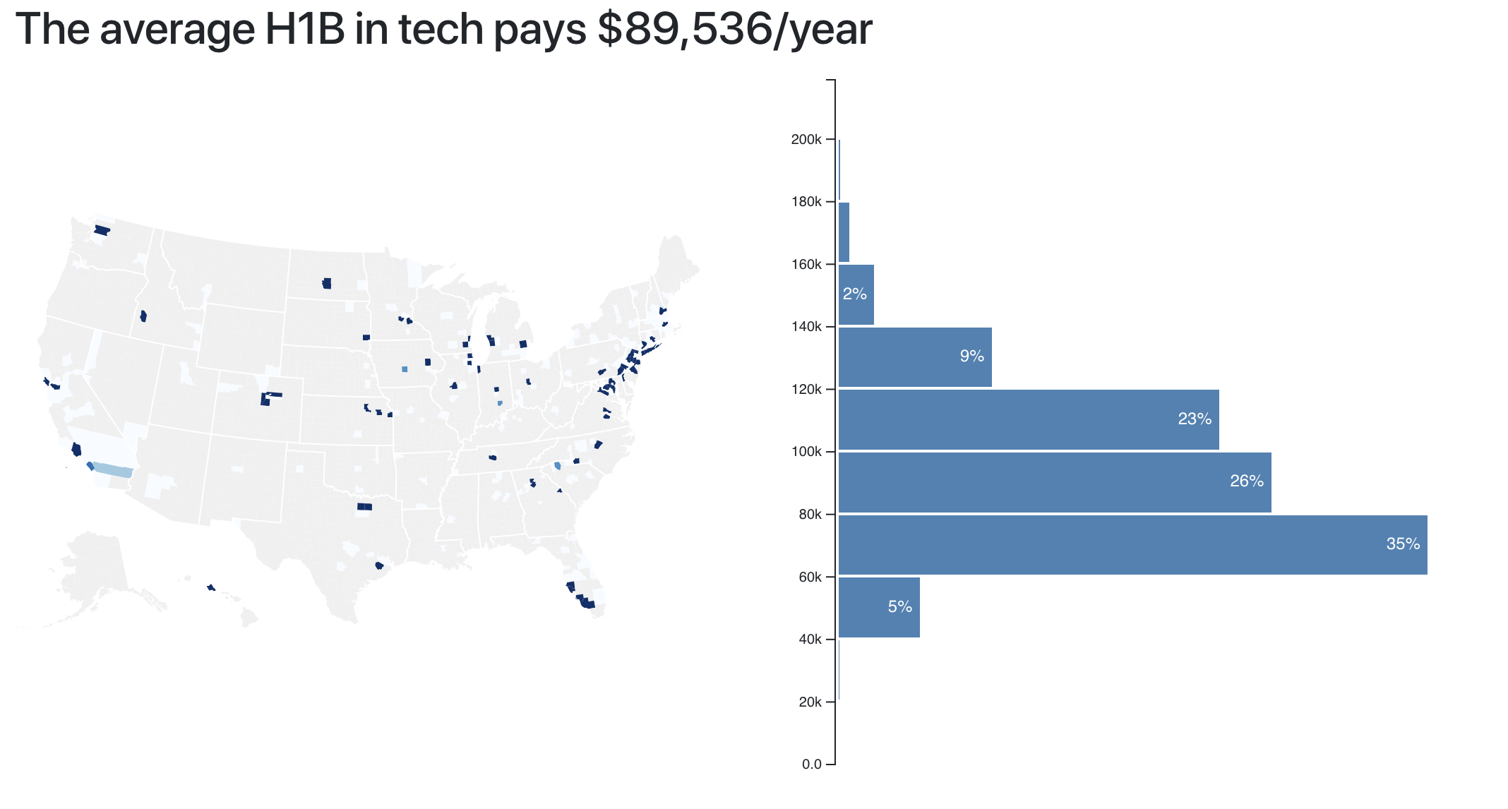
And a title appears after a little debugging.
Dynamic description
You know what? The dynamic description component is pretty much the same as the title. It's just longer and more complex and uses more code. It's interesting, but not super relevant to the topic of this book.
So rather than explain it all here, I'm going to give you a link to the diff on Github
We use the same approach as before:
- Add imports in
App.js - Add component to
Apprender - Implement component in
components/Meta.js - Use getters for sentence fragments
- Play with conditionals to construct different sentences
142 lines of mundane code.
All the interesting complexity goes into finding the richest city and county. That part looks like this:
// src/components/Meta/Description.jsget countyFragment() {const byCounty = _.groupBy(this.props.data, 'countyID'),medians = this.props.medianIncomesByCounty;let ordered = _.sortBy(_.keys(byCounty).map(county => byCounty[county]).filter(d => d.length/this.props.data.length > 0.01),items => d3mean(items,d => d.base_salary) - medians[items[0].countyID][0].medianIncome);let best = ordered[ordered.length-1],countyMedian = medians[best[0].countyID][0].medianIncome;// ...}
We group the dataset by county, then sort counties by their income delta. We look only at counties that are bigger than 1% of the entire dataset. And we define income delta as the difference between a county's median household income and the median tech salary in our dataset.
This code is not super efficient, but it gets the job done. We could optimize by just looking for the max value, for example.
Similar code handles finding the best city.
Render the description
I recommend copying the
Description component from GitHub.
Most of it has little to do with React and data visualization. It's all about
combining sentence fragments based on props.
You then render the Description like this:
// src/components/App.jsimport { Title, Description } from "./components/Meta"// ..;<Descriptiondata={filteredSalaries}allData={techSalaries}filteredBy={filteredBy}medianIncomesByCounty={this.state.medianIncomesByCounty}/>
Overlay a median household line
Here's a more interesting component: the median dotted line. It shows a direct comparison between the histogram's distribution and the median household income in an area. I'm not sure people understand it at a glance, but I think it's cool.
We're using a quick approach where everything fits into a functional React component. It's great for small components like this.
Step 1: App.js
Inside src/App.js, we first have to add an import, then extract the median
household value from state, and in the end, add MedianLine to the render
method.
Let's see if we can do it in a single code block 😄
// src/App.jsimport Histogram from './components/Histogram';import { Title, Description, GraphDescription } from './components/Meta';// Insert the line(s) between here...import MedianLine from './components/MedianLine';// ...and here.function App() {// ...let zoom = null,// Insert the line(s) between here...medianHousehold = medianIncomesByUSState['US'][0].medianIncome;// ...and here.return (// ...<svg width="1100" height="500"><CountyMap // ... /><Histogram // ... />// Insert the line(s) between here...<MedianLine data={filteredSalaries}x={500}y={10}width={600}height={500}bottomMargin={5}median={medianHousehold}value={d => d.base_salary} />// ...and here.</svg>)}
You probably don't remember medianIncomesByUSState anymore. We set it up when tying datasets together.
It groups our salary data by US state.
See, using good names helps 😄
When rendering MedianLine, we give it sizing and positioning props, the
dataset, a value accessor, and the median value to show. We could make it
smart enough to calculate the median, but the added flexibility of a prop felt
right.
Step 2: MedianLine
The MedianLine component looks similar to what you've seen so far. Some
imports, a constructor that sets up D3 objects, an updateD3 method that
keeps them in sync, and a render method that outputs SVG.
// src/components/MedianLine.jsimport React from "react"import * as d3 from "d3"const MedianLine = ({data,value,width,height,x,y,bottomMargin,median,}) => {}export default MedianLine
We have some imports, a functional MedianLine component that takes our props,
and an export. It should cause an error because it's not returning anything.
Everything we need to render the line, fits into this function.
// src/components/MedianLine.jsconst MedianLine = ({// ...}) => {const yScale = d3.scaleLinear().domain([0, d3.max(data, value)]).range([height - y - bottomMargin, 0]),line = d3.line()([[0, 5],[width, 5],])const medianValue = median || d3.median(data, value)const translate = `translate(${x}, ${yScale(medianValue)})`,medianLabel = `Median Household: $${yScale.tickFormat()(median)}`return (<g className="mean" transform={translate}><textx={width - 5}y="0"textAnchor="end"style={{ background: "purple" }}>{medianLabel}</text><path d={line} /></g>)}
We start with a scale for vertical positioning – yScale. It's linear, takes
values from 0 to max, and translates them to pixels less some margin. For
the medianValue, we use props, or calculate our own, if needed. Just like I
promised.
A translate SVG transform helps us position our line and label. We use it all
to return a <g> grouping element containing a <text> for our label, and a
<path> for the line.
Building the d attribute for the path, that's interesting. We use a line
generator from D3.
line = d3.line()([[0, 5],[width, 5],])
It comes from the d3-shape package and
generates splines, or polylines. By default, it takes an array of points and
builds a line through all of them. A line from [0, 5] to [width, 5] in our
case.
That makes it span the entire width and leaves 5px for the label. We're using a
transform on the entire group to vertically position the final element.
Remember, we already styled medianLine when we built
histogram styles
earlier.
.mean text {font: 11px sans-serif;fill: grey;}.mean path {stroke-dasharray: 3;stroke: grey;stroke-width: 1px;}
The stroke-dasharray is what makes it dashed. 3 means each 3px dash is
followed by a 3px blank. You can use
any pattern you like.
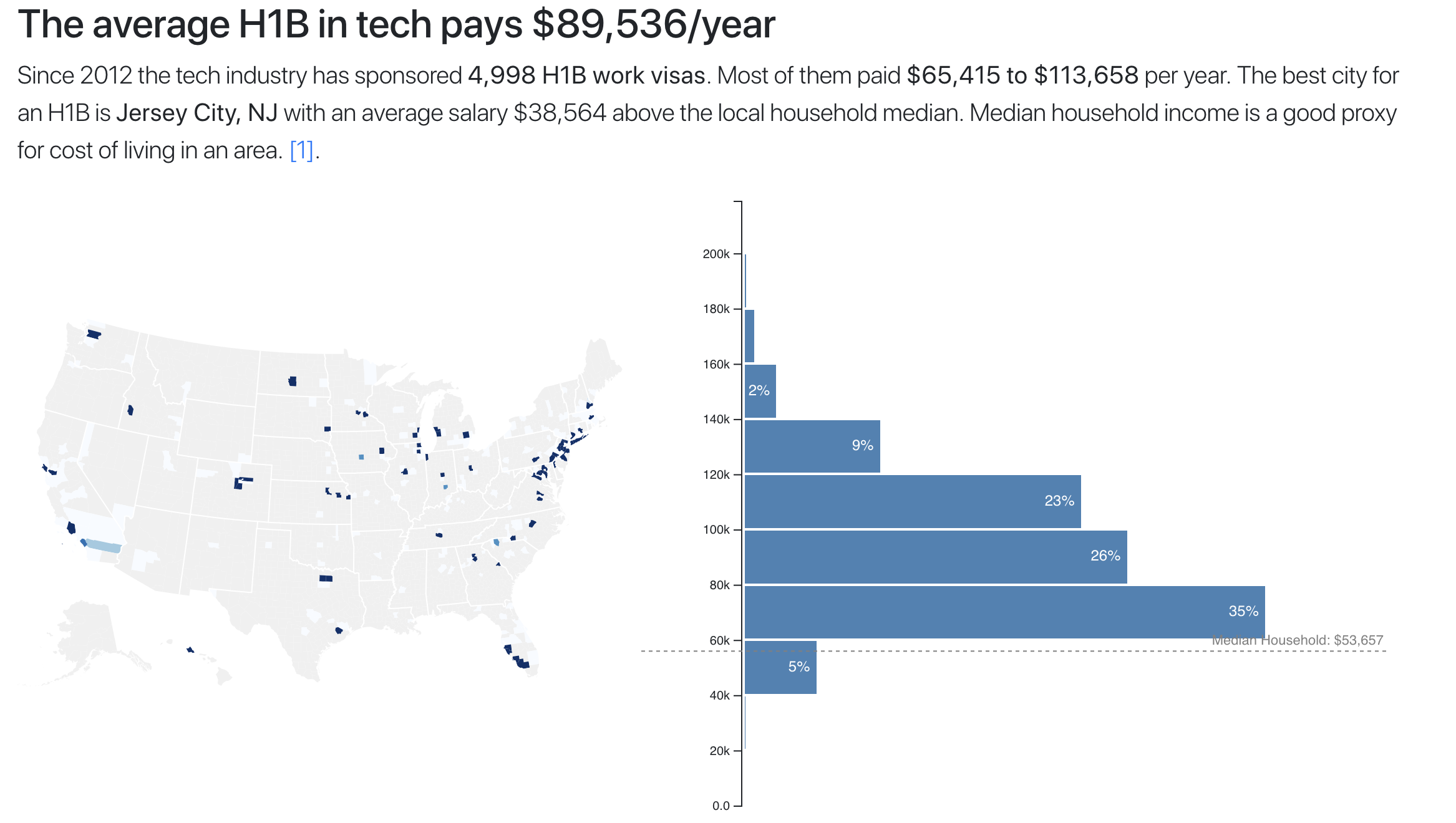
You should see a median household salary line overlaid on your histogram.
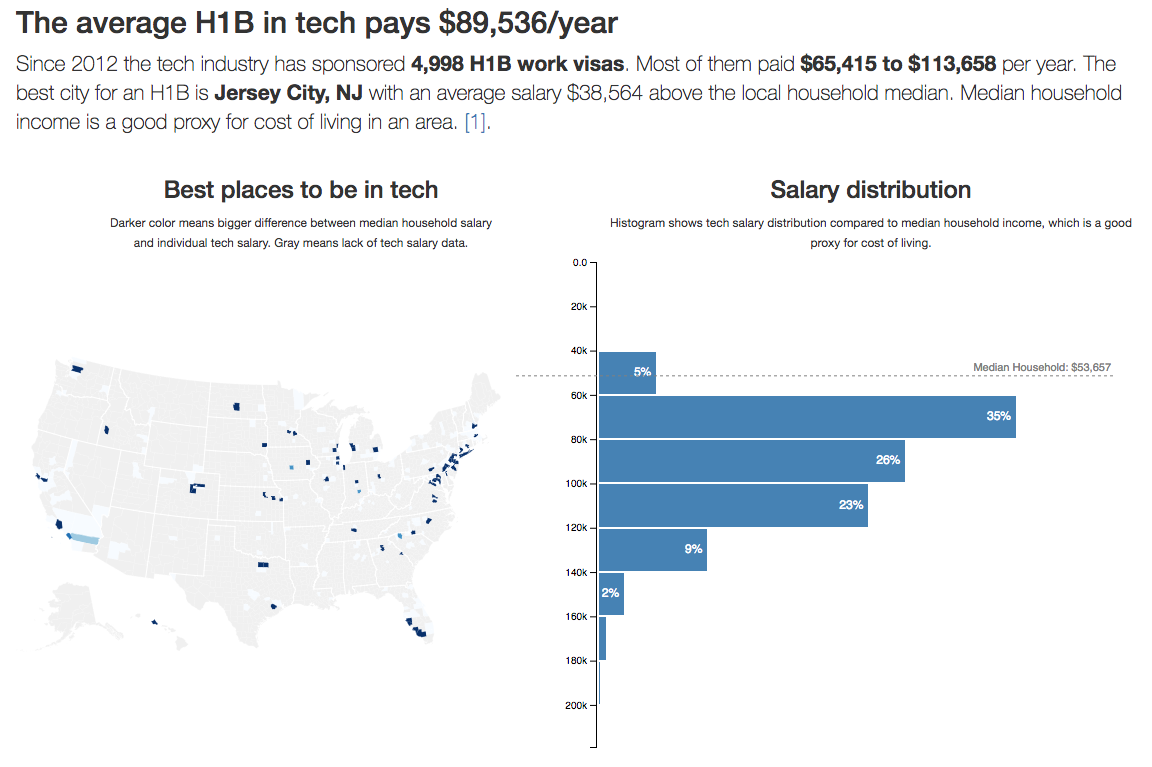
Almost everyone in tech makes more than an entire median household. Crazy, huh? I think it is.
If that didn't work, consult the diff on Github.