

Render a Histogram of salaries
Knowing median salaries is great and all, but it doesn't tell you much about what you can expect. You need to know the distribution to see if it's more likely you'll get 140k or 70k.
That's what histograms are for. Give them a bunch of data, and they show its distribution. We're going to build one like this:
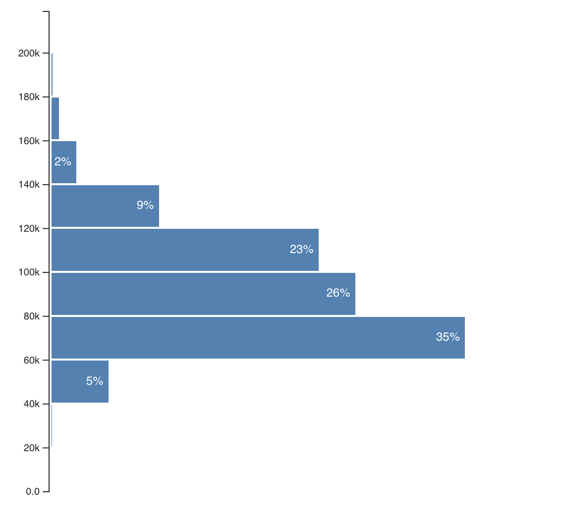
In the shortened dataset, 35% of tech salaries fall between \$60k and \$80k, 26% between \$80k and \$100k etc. Throwing a weighed dice with this random distribution, you're far more likely to get 60k-80k than 120k-140k. It's a great way to gauge situations.
It's where statistics like "More people die from vending machines than shark attacks" come from. Which are you afraid of, vending machines or sharks? Stats say your answer should be heart disease. 😉
We'll start our histogram with some changes in App.js, make a Histogram
component using the
full-feature approach,
add an Axis using the
blackbox useD3 approach,
and finally add some styling.
Step 1: Prep App.js
You know the drill, don't you? Import some stuff, add it to the render()
method in the App component.
// src/App.jsimport _ from "lodash"// Insert the line(s) between here...import "./style.css"// ...and here.import Preloader from "./components/Preloader"import { loadAllData } from "./DataHandling"import CountyMap from "./components/CountyMap"// Insert the line(s) between here...import Histogram from "./components/Histogram"// ...and here.
We import style.css and the Histogram component. That's what I love about
Webpack - you can import CSS in JavaScript. We got the setup with
create-react-app.
There are competing schools of thought about styling React apps. Some say each component should come with its own CSS files, some think it should be in large per-app CSS files, many think CSS-in-JS is the way to go.
Personally I like to use CSS for general cross-component styling and styled-components for more specific styles. We're using CSS in this project because it works and means we don't have to learn yet another dependency.
After the imports, we can render our Histogram in the App component.
// src/App.js// ...render() {// ...return (<div className="App container"><h1>Loaded {this.state.techSalaries.length} salaries</h1><svg width="1100" height="500"><CountyMap usTopoJson={this.state.usTopoJson}USstateNames={this.state.USstateNames}values={countyValues}x={0}y={0}width={500}height={500}zoom={zoom} />// Insert the line(s) between here...<Histogram bins={10}width={500}height={500}x="500"y="10"data={filteredSalaries}axisMargin={83}bottomMargin={5}value={d => d.base_salary} />// ...and here.</svg></div>);}
We render the Histogram component with a bunch of props. They specify the
dimensions we want, positioning, and pass data to the component. We're using
filteredSalaries even though we haven't set up any filtering yet. One less
line of code to change later 👌
That's it. App is ready to render our Histogram.
You should now see an error about missing files. That's normal.
Step 2: CSS changes
As mentioned, opinions vary on the best approach to styling React apps. Some say stylesheets per component, some say styling inside JavaScript, others swear by global app styling.
The truth is somewhere in between. Do what fits your project and your team. We're using global stylesheets because it's the simplest.
Create a new file src/style.css and add these 29 lines:
.histogram .bar rect {fill: steelblue;shape-rendering: crispEdges;}.histogram .bar text {fill: #fff;font: 12px sans-serif;}button {margin-right: 0.5em;margin-bottom: 0.3em !important;}.row {margin-top: 1em;}.mean text {font: 11px sans-serif;fill: grey;}.mean path {stroke-dasharray: 3;stroke: grey;stroke-width: 1px;}
We won't go into details about the CSS here. Many better books have been written about it.
In broad strokes:
- we're making
.histogramrectangles – the bars – blue - labels white
12pxfont buttons and.rows have some spacing- the
.meanline is a dotted grey with gray11pxtext.
More CSS than we need for just the histogram, but we're already here so might as well write it now.
Adding our CSS before building the Histogram means it's going to look beautiful the first time around.
Step 3: Histogram component
We're following the full-feature integration approach for our Histogram component. React talks to the DOM, D3 calculates the props.
We'll use two components:
Histogrammakes the general layout, dealing with D3, and translating raw data into a histogramHistogramBardraws a single bar and labels it
We create the Histogram.js file. Start with some imports, a default export,
and a stubbed out Histogram class.
// src/components/Histogram.jsimport React from "react"import * as d3 from "d3"const Histogram = ({bins,width,height,x,y,data,axisMargin,bottomMargin,value,}) => {const histogram = d3.histogram()const widthScale = d3.scaleLinear()const yScale = d3.scaleLinear()return null}
We import React and D3, and set up Histogram with 3 D3 elements
- a histogram generator
- a linear width scale
- a linear y scale
Rendering the histogram
// src/components/Histogram.jsconst histogram = d3.histogram().thresholds(bins).value(value)const bars = histogram(data),counts = bars.map((d) => d.length)const widthScale = d3.scaleLinear().domain([d3.min(counts), d3.max(counts)]).range([0, width - axisMargin])const yScale = d3.scaleLinear().domain([0, d3.max(bars, (d) => d.x1)]).range([height - y - bottomMargin, 0])
First, we configure the histogram generator. thresholds specify how many
bins we want and value specifies the value accessor function. We get both
from props passed into the Histogram component.
In our case that makes 20 bins, and the value accessor returns each data
point's base_salary.
We feed the data prop into our histogram generator, and count how many values
are in each bin with a .map call. We need those to configure our scales.
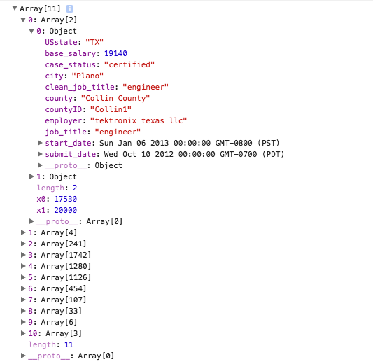
If you print the result of histogram(), you'll see an array structure where
each entry holds metadata about the bin and the values it contains.
Let's use this info to set up our scales.
widthScale has a range from the smallest (d3.min) bin to the largest
(d3.max), and a range of 0 to width less a margin. We'll use it to
calculate bar sizes.
yScale has a range from 0 to the largest x1 coordinate we can find in a
bin. Bins go from x0 to x1, which reflects the fact that most histograms
are horizontally oriented. Ours is vertical so that our labels are easier to
read. The range goes from 0 to the maximum height less a margin.
Now let's render this puppy.
render
// src/components/Histogram.js<g className="bars">{bars.map((bar) => (<HistogramBarpercent={(bar.length / data.length) * 100}x={axisMargin}y={yScale(bar.x1)}width={widthScale(bar.length)}height={yScale(bar.x0) - yScale(bar.x1)}key={`histogram-bar-${bar.x0}`}/>))}</g>
We take everything we need out of state and props with destructuring, call
histogram() on our data to get a list of bars, and render.
Our render method returns a <g> grouping element transformed to the position
given in props and walks through the bars array, calling makeBar for each.
Later, we're going to add an Axis as well.
This is a great example of React's declarativeness. We have a bunch of stuff, and all it takes to render is a loop. No worrying about how it renders, where it goes, or anything like that. Walk through data, render, done.
Setting the key prop is important. React uses it to tell the bars apart and
only re-render those that change.
Step 4: HistogramBar (sub)component
Before our histogram shows up, we need another component: HistogramBar. We
could have shoved all of it in the makeBar function, but it makes sense to
keep separate. Better future flexibility.
You can write small components like this in the same file as their main component. They're not reusable since they fit a specific use-case, and they're small enough so your files don't get too crazy.
But in the interest of readability, let's make a HistogramBar file.
// src/components/Histogram.jsconst HistogramBar = ({ percent, x, y, width, height }) => {let translate = `translate(${x}, ${y})`,label = percent.toFixed(0) + "%"if (percent < 1) {label = percent.toFixed(2) + "%"}if (width < 20) {label = label.replace("%", "")}if (width < 10) {label = ""}return (<g transform={translate} className="bar"><rect width={width} height={height - 2} transform="translate(0, 1)" /><text textAnchor="end" x={width - 5} y={height / 2 + 3}>{label}</text></g>)}
We start by deciding how much precision to put in the label. Makes the smaller bars easier to read :)
Then we render a rectangle for the bar and add a text element for the label. Positioning based on size.
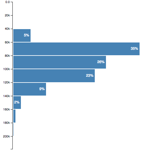
You should now see a histogram.
Step 5: Axis
Our histogram is pretty, but it needs an axis to be useful. You've already learned how to implement an axis when we talked about blackbox integration. We're going to use the same approach and copy those concepts into the real project.
Axis component
We can use the useD3 hook from my d3blackbox library to make this work quickly.
// src/components/Axis.jsimport React from "react"import { useD3 } from "d3blackbox"import * as d3 from "d3"const Axis = ({ x, y, scale, type = "Bottom" }) => {const gRef = useD3((anchor) => {const axis = d3[`axis${type}`](scale)d3.select(anchor).call(axis)})return <g transform={`translate(${x}, ${y})`} ref={gRef} />}export default Axis
We use D3's axis generator based on the type prop and pass in a scale. To render, we select the anchor element and call the axis generator on it.
Add Axis to Histogram
To render our new Axis, we add it to the Histogram component. It's a two
step process:
- Import
Axiscomponent - Render it
// src/components/Histogram/Histogram.jsimport React, { Component } from "react"import * as d3 from "d3"// Insert the line(s) between here...import Axis from "./Axis"// ...and here.// ...const Histogram = () => {// ...return (<g className="histogram" transform={translate}><g className="bars">{bars.map(this.makeBar)}</g>// Insert the line(s) between here...<Axis x={axisMargin - 3} y={0} data={bars} scale={yScale} />// ...and here.</g>)}
We import our Axis and add it to the render method with some props. It
takes an x and y coordinate, the data, and a scale.
An axis appears.
If that didn't work, try comparing your changes to this diff on Github.