

Render a choropleth map of the US
With our data in hand, it's time to draw some pictures. A choropleth map will show us the best places to be in tech.
We're showing the delta between median household salary in a statistical county and the average salary of an individual tech worker on a visa. The darker the blue, the higher the difference.
The more a single salary can out-earn an entire household, the better off you are.
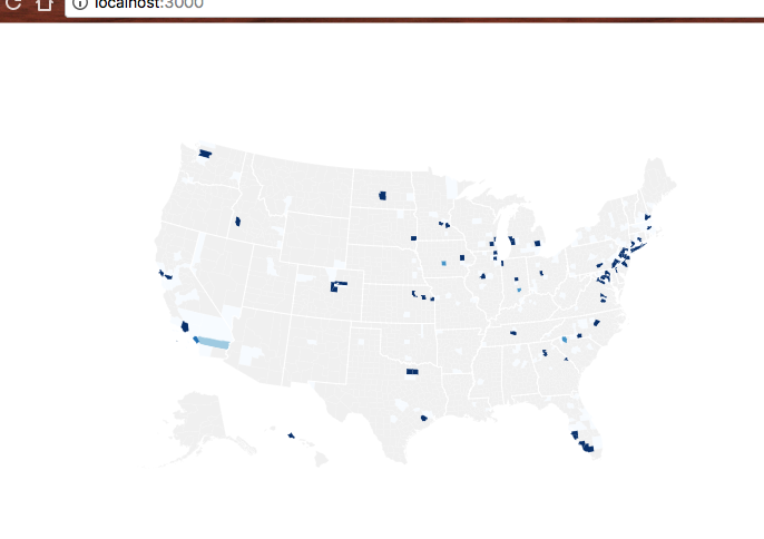
There's a lot of gray on this map because the shortened dataset doesn't have that many counties. Full dataset is going to look better, I promise.
Turns out immigration visa opportunities for techies aren't evenly distributed throughout the country. Who knew?
Just like before, we're going to start with changes in our App component,
then build the new bit.
Step 1: Prep App.js
You might guess the pattern already: add an import, add a helper method or two,
update render.
// src/App.jsimport Preloader from "./components/Preloader"import { loadAllData } from "./DataHandling"// Insert the line(s) between here...import CountyMap from "./components/CountyMap"// ...and here.
That imports the CountyMap component from components/CountyMap/. Your
browser will show an error overlay about some file or another until we're done.
In the App class itself, we add a countyValue method. It takes a county
entry and a map of tech salaries, and it returns the delta between median
household income and a single tech salary.
// src/App.jsfunction countyValue(county, techSalariesMap) {const medianHousehold = medianIncomes[county.id],salaries = techSalariesMap[county.name]if (!medianHousehold || !salaries) {return null}const median = d3.median(salaries, (d) => d.base_salary)return {countyID: county.id,value: median - medianHousehold.medianIncome,}}
We use medianIncomes to get the median household salary and the
techSalariesMap input to get salaries for a specific census area. Then we use
d3.median to calculate the median value for salaries and return a two-element
dictionary with the result.
countyID specifies the county and value is the delta that our choropleth
displays.
In the render method, we'll:
- prep a list of county values
- remove the "data loaded" indicator
- render the map
// src/App.jsrender() {// ...if (techSalaries.length < 1) {return (<Preloader />);}// Insert the line(s) between here...const filteredSalaries = techSalaries,filteredSalariesMap = _.groupBy(filteredSalaries, 'countyID'),countyValues = countyNames.map(county => countyValue(county, filteredSalariesMap)).filter(d => !_.isNull(d));let zoom = null;// ...and here.return (<div className="App container"><svg width="1100" height="500"><CountyMap usTopoJson={usTopoJson}USstateNames={USstateNames}values={countyValues}x={0}y={0}width={500}height={500}zoom={zoom} /></svg></div>);}
We call our dataset filteredTechSalaries because we're going to add filtering in the subchapter about adding user controls. Using the proper name now means less code to change later. The magic of foresight 😄
We use _.groupBy to build a dictionary mapping each countyID to an array of
salaries, and we use our countyValue method to build an array of counties for
our map.
We set zoom to null for now. We'll use this later.
In the return statement, we remove our "data loaded" indicator, and add an
<svg> element that's 1100 pixels wide and 500 pixels high. Inside, we
place the CountyMap component with a bunch of properties. Some dataset stuff,
some sizing and positioning stuff.
Step 1.1: Simplify App.js state
We simplify state into a single object that holds all datasets. That way we can save some re-renders and make our life easier too.
// src/App.jsconst [datasets, setDatasets] = useState({techSalaries: [],medianIncomes: [],countyNames: [],usTopoJson: null,USstateNames: null,})const {techSalaries,medianIncomes,countyNames,usTopoJson,USstateNames,} = datasetsasync function loadData() {const datasets = await loadAllData()setDatasets(datasets)}
Step 3: CountyMap.js
Here comes the fun part - declaratively drawing a map. You'll see why I love using React for dataviz.
We're using the full-feature integration approach and a lot of D3 maps magic. Drawing a map with D3 I'm always surprised how little code it takes.
Start with the imports: React, D3, lodash, topojson, County component.
// src/components/CountyMap.jsimport React from "react"import * as d3 from "d3"import * as topojson from "topojson"import _ from "lodash"
Out of these, we haven't built County yet, and you haven't seen topojson
before.
TopoJSON is a geographical data format based on JSON. We're using the
topojson library to translate our geographical datasets into GeoJSON, which
is another way of defining geo data with JSON.
I don't know why there are two, but TopoJSON produces smaller files, and GeoJSON can be fed directly into D3's geo functions. ¯\(ツ)/¯
Maybe it's a case of competing standards.
Constructor
We stub out the CountyMap component then fill it in with logic.
// src/components/CountyMap/CountyMap.jsconst CountyMap = ({usTopoJson,USstateNames,x,y,width,height,zoom,values,}) => {if (!usTopoJson) {return null;}else{return ();}}}export default CountyMap;
We need three D3 objects to build a choropleth map: a geographical projection, a path generator, and a quantize scale for colors.
// src/components/CountyMap.jsconst projection = d3.geoAlbersUsa().scale(1280)const geoPath = d3.geoPath().projection(projection)const quantize = d3.scaleQuantize().range(d3.range(9))
You might remember geographical projections from high school. They map a sphere
to a flat surface. We use geoAlbersUsa because it's made specifically for
maps of the USA.
D3 offers many other projections. You can see them on d3-geo's Github page.
A geoPath generator takes a projection and returns a function that generates
the d attribute of <path> elements. This is the most general way to specify
SVG shapes. I won't go into explaining the d here, but it's
an entire language
for describing shapes.
quantize is a D3 scale. We've talked about the basics of scales in the
D3 Axis example.
This one splits a domain into 9 quantiles and assigns them specific values from
the range.
Let's say our domain goes from 0 to 90. Calling the scale with any number between 0 and 9 would return 1. 10 to 19 returns 2 and so on. We'll use it to pick colors from an array.
the D3 magic sauce
Keeping our geo path and quantize scale up to date is simple, but we'll make it harder by adding a zoom feature. It won't work until we build the filtering, but hey, we'll already have it by then! 😄
// src/components/CountyMap.jsconst projection = d3.geoAlbersUsa().scale(1280).translate([width / 2, height / 2]).scale(width * 1.3)const geoPath = d3.geoPath().projection(projection)const quantize = d3.scaleQuantize().range(d3.range(9))if (zoom && usTopoJson) {const us = usTopoJson,USstatePaths = topojson.feature(us, us.objects.states).features,id = _.find(USstateNames, { code: zoom }).idprojection.scale(width * 4.5)const centroid = geoPath.centroid(_.find(USstatePaths, { id: id })),translate = projection.translate()projection.translate([translate[0] - centroid[0] + width / 2,translate[1] - centroid[1] + height / 2,])}if (values) {quantize.domain([d3.quantile(values, 0.15, (d) => d.value),d3.quantile(values, 0.85, (d) => d.value),])}
There's a lot going on here.
We destructure projection, quantize, and geoPath out of component state.
These are the D3 object we're about to update.
First up is the projection. We translate (move) it to the center of our drawing area and set the scale property. You have to play around with this value until you get a nice result because it's different for every projection.
Then we do some weird stuff if zoom is defined.
We get the list of all US state features in our geo data, find the one we're
zoom-ing on, and use the geoPath.centroid method to calculate its center
point. This gives us a new coordinate to translate our projection onto.
The calculation in .translate() helps us align the center point of our zoom
US state with the center of the drawing area.
While all of this is going on, we also tweak the .scale property to make the
map bigger. This creates a zooming effect.
After all that, we update the quantize scale's domain with new values. Using
d3.quantile lets us offset the scale to produce a more interesting map.
Again, I discovered these values through experiment - they cut off the top and
bottom of the range because there isn't much there. This brings higher contrast
to the richer middle of the range.
render
After all that hard work, rendering is a breeze. We prep our data
then loop through it and render a County element for each entry.
// src/components/CountyMap.jsif (!usTopoJson) {return null} else {const us = usTopoJson,USstatesMesh = topojson.mesh(us, us.objects.states, (a, b) => a !== b),counties = topojson.feature(us, us.objects.counties).featuresconst countyValueMap = _.fromPairs(values.map((d) => [d.countyID, d.value]))return (<g>{counties.map((feature) => (<CountygeoPath={geoPath}feature={feature}zoom={zoom}key={feature.id}quantize={quantize}value={countyValueMap[feature.id]}/>))}<pathd={geoPath(USstatesMesh)}style={{fill: "none",stroke: "#fff",strokeLinejoin: "round",}}/></g>)}
We use the TopoJSON library to grab data out of the usTopoJson dataset.
.mesh calculates a mesh for US states – a thin line around the edges.
.feature calculates feature for each count – fill in with color.
Mesh and feature aren't tied to US states or counties by the way. It's just a matter of what you get back: borders or flat areas. What you need depends on what you're building.
We use Lodash's _.fromPairs to build a dictionary that maps county
identifiers to their values. Building it beforehand makes our code faster. You
can read some details about the speed optimizations
here.
As promised, the return statement loops through the list of counties and
renders County components. Each gets a bunch of attributes and returns a
<path> element that looks like a specific county.
For US state borders, we render a single <path> element and use geoPath to
generate the d attribute.
Step 4: County component
The County component is built from two parts: imports and color constants,
and a component that returns a <path>. All the hard calculation happens in
CountyMap.
// src/components/CountyMap.jsconst ChoroplethColors = _.reverse(["rgb(247,251,255)","rgb(222,235,247)","rgb(198,219,239)","rgb(158,202,225)","rgb(107,174,214)","rgb(66,146,198)","rgb(33,113,181)","rgb(8,81,156)","rgb(8,48,107)",])const BlankColor = "rgb(240,240,240)"
We import React and Lodash, and define some color constants. I got the
ChoroplethColors from some example online, and BlankColor is a pleasant
gray.
Now we need the County component.
// src/components/CountyMap.jsconst County = ({ geoPath, feature, zoom, key, quantize, value }) => {let color = BlankColorif (value) {color = ChoroplethColors[quantize(value)]}return (<path d={geoPath(feature)} style={{ fill: color }} title={feature.id} />)}
The render method uses a quantize scale to pick the right color and returns
a <path> element. geoPath generates the d attribute, we set style to
fill the color, and we give our path a title.
Your browser should now show a map.
Tech work visas just aren't that evenly distributed. Even with the full dataset most counties are gray.
If that didn't work, consult this diff on Github.
Step 5: optimize D3 code with custom hooks
Our CountyMap component got quite messy with all that D3 logic in there. We can clean it up with custom hooks.
The goal is to extract logic into self-contained custom hooks that return the end result we're looking for. Logic in the function, do the math, return the final D3 object.
Remember: any function that uses hooks is a hook. We prefix them with use out of convention.
While we're at it we can also wrap the code in useMemo so our code runs faster. useMemo ensures we recreate the objects only when something relevant changes.
// src/components/CountyMap.jsfunction useQuantize(values) {return useMemo(() => {const scale = d3.scaleQuantize().range(d3.range(9))if (values) {scale.domain([d3.quantile(values, 0.15, (d) => d.value),d3.quantile(values, 0.85, (d) => d.value),])}return scale}, [values])}function useProjection({ width, height, zoom, usTopoJson, USstateNames }) {return useMemo(() => {const projection = d3.geoAlbersUsa().scale(1280).translate([width / 2, height / 2]).scale(width * 1.3)const geoPath = d3.geoPath().projection(projection)if (zoom && usTopoJson) {const us = usTopoJson,USstatePaths = topojson.feature(us, us.objects.states).features,id = _.find(USstateNames, { code: zoom }).idprojection.scale(width * 4.5)const centroid = geoPath.centroid(_.find(USstatePaths, { id: id })),translate = projection.translate()projection.translate([translate[0] - centroid[0] + width / 2,translate[1] - centroid[1] + height / 2,])}return geoPath}, [width, height, zoom, usTopoJson, USstateNames])}
You can then use them as any other hook:
// src/components/CountyMap.jsconst CountyMap = ({usTopoJson,USstateNames,x,y,width,height,zoom,values,}) => {const geoPath = useProjection({width,height,zoom,usTopoJson,USstateNames,});const quantize = useQuantize(values);
If that doesn't work, check out this diff on GitHub